Effect Icon Creation
Are you ready to submit and publish your effect? First, you'll need effect icons that visually represent your effect to the public. You can either design face-based icons using Effect Icon Creator, or create your own images separately and upload them as effect icons. This guide demonstrates both ways of creating effect icons.
Open Effect Icon Creator
To open Effect Icon Creator, click the Create icon button in the titlebar.
You can also open Effect Icon Creator directly from the submission form by clicking the Add button [+] under Effect Icon.
Use Preselected Templates from Effect Icon Creator
Use Effect Icon Creator to easily apply your effect to one of many available templates. This method of effect icon creation is most applicable to face-based effects, like makeup. It is also the first option you'll see when you open the Effect Icon Creator.
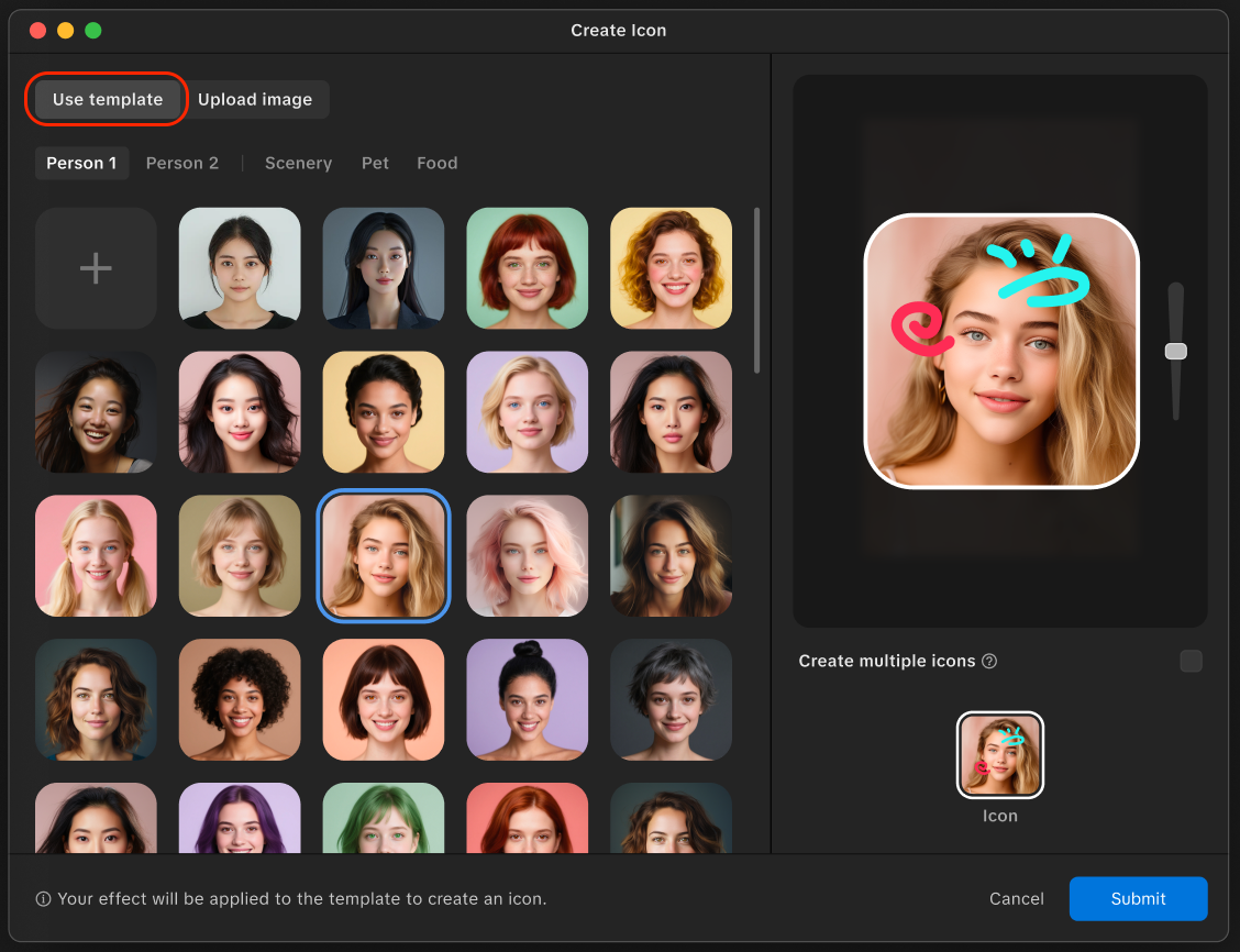
To choose a template:
- Open Effect Icon Creator
- Choose from one of the available templates. You can also filter the templates by selecting a category:
- Scenery
- Pet
- Food
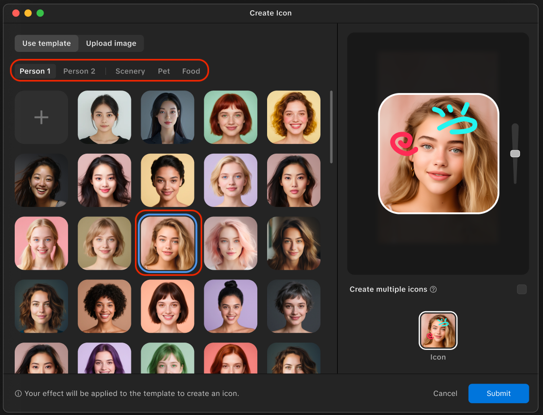
- After you've selected a template, you can crop and resize it to your liking
- Click Submit
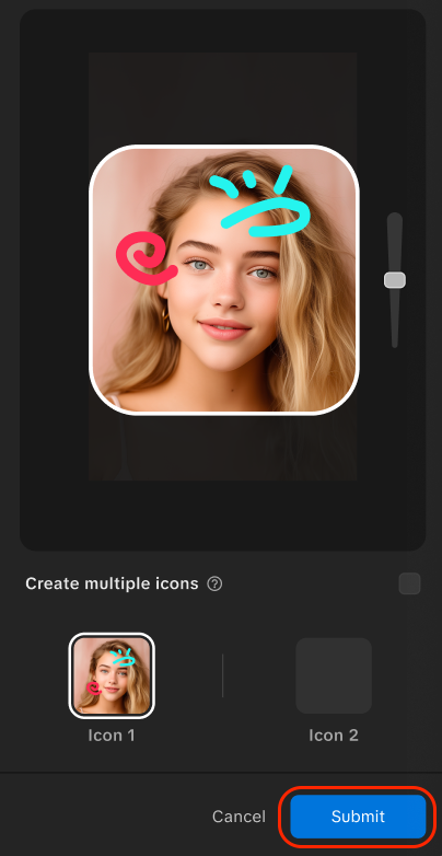
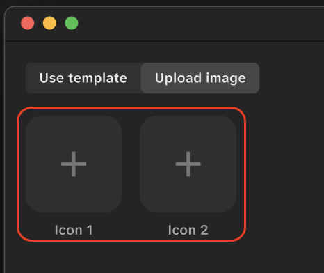
Create Multiple Icons
To attract more creators, you can create up to two icons using different template categories.
When Create multiple icons is enabled, you'll have the option to add up to two icons.
To apply a template to a specific icon:
- Click on either Icon 1 or Icon 2
- Choose from one of the available templates
- Crop and resize it to your liking
- Click Submit
Design Your Own Effect Icon
You can also create your own effect icon separately. This is most applicable to effects that don't necessarily involve a face. You can use an image processing tool, screenshots, or other illustrative methods to create a design that visually represents your effect. Learn more about the best practices for designing your icons.
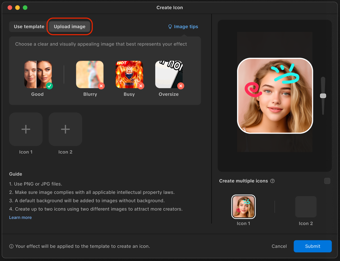
To upload your own image:
- Open Effect Icon Creator
- Click Upload image
- Click the Add button [+]. Select an image file from your computer.
- Click Open
- Crop and resize the image to your liking
- Click Submit
Create Multiple Icons
To attract more creators, you can create up to two icons using different template categories.
When Create multiple icons is enabled, you'll have the option to add up to two icons.
To upload an image and apply it to a specific icon:
- Click on either Icon 1 or Icon 2
- Click the Add button [+]. Select an image file from your computer.
- Click Open
- Crop and resize the image to your liking
- Click Submit
Design Your Own Effect Icon
You can also create your own effect icon separately. This is most applicable to effects that don't necessarily involve a face. You can use an image processing tool, screenshots, or other illustrative methods to create a design that visually represents your effect.
Open Effect Icon Creator and switch to Upload image. Click the Add button [+] to select a file from your computer.
Crop and resize the image to your liking. Once you are finished, click Done.
Best Practices for Designing Your Icons
As you design your effect icon, remember to follow our best practices below to ensure that your design is eligible to be published.
While the size of your full design canvas will be 162 x 162 px, your safe design area will be the central 144 x 144 px.
- File format: PNG
- Safe area: 144 x 144 px
- Export size: 162 x 162 px
Visual Quality Examples
Choose a clear, visually appealing image that best represents your effect.
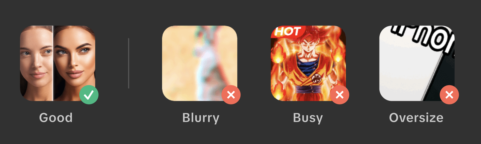
- Good — Use a clear, focused image that represents the effect
- Avoid blurry images — Don't use low-resolution or out-of-focus images
- Avoid busy designs — Don't use overcrowded or overly detailed artwork as it won't display well in small sizes
- Avoid oversized subjects — Don't crop the subject or make it so large it becomes unrecognizable in the icon
Additional Guidelines
- Ensure the image complies with all applicable intellectual property laws
- A default background will be added to images without one
- You can create up to two icons using different images to attract more creators
When you upload your effect icon, Effect House will help to crop and optimize it with a round corner and transparent blend zone
Visual Design
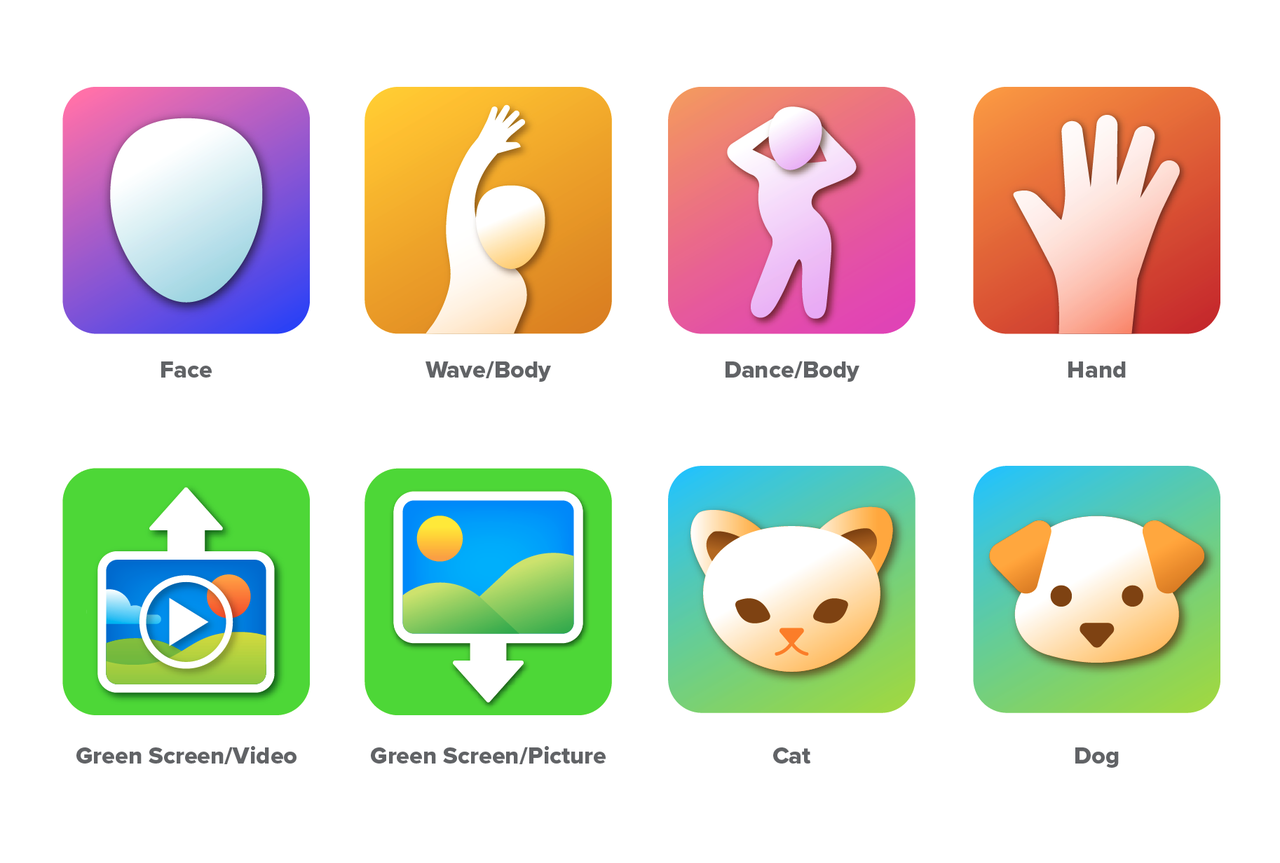
Focus on the Effect
Focus on the essence of each effect and redesign it in your effect icon. The goal is to communicate an effect quickly and clearly. You don't need to include all the effect details; pick one to three key features and design elements that best describe what the effect does.
Simplicity and Readability
Don't over-complicate or overfill the design with unnecessary details. You also don't need to fill the entire content area. Capture the effects' intent in a way that's readable at a small size.
Graphics and Illustration Style
The effect icon style is based on a flat vector graphic approach and generally uses solid shapes with subtle gradients and drop shadows. Don't include photographic details and avoid using different illustrative styles.

Exceptions to graphics guidelines can be made for Branded Effects that require a certain visual style or photos in their effect icons
Consistency is Key
Try to be consistent in your choice of design elements. You want to ensure that users recognize and understand your effect icons. Don't try and reinvent the wheel when there's already an existing design that represents a specific idea or action.
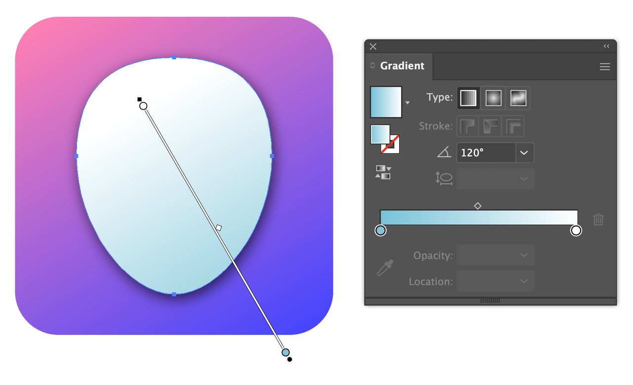
Gradients
Use gradients for background and large solid shapes. They're a great way to add depth into the effect icon design, creating a clean and refreshing look. To avoid visual noise, we recommend using no more than three colors in a gradient; two-color gradients often provide the best balance for effect icons.
Recommended gradient metrics:
- Angle: 60° or 120° | Type: Linear
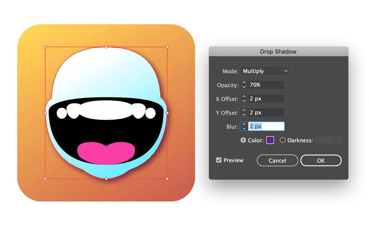
Shadows
Shadows can help emphasize an image and lift it from the background. Use image shadows to add dimension to and highlight flat shapes.
Recommended shadow metrics: Opacity: 70% | X and Y Offset: 2px | Blur: 2px
Typography and Copy
Use text in effect icons only when it is an essential part of the effect. Use minimal text and make sure it is easy to read on a small scale. Use the word "TEXT" to represent effects that include any text edits.
Open the Submission Form
When you are ready to submit your effect, click the Submit button in the titlebar. Your effect icon appears in the Effect Icon section. If you would like to further edit your effect icon, click on it in the submission form to open Effect Icon Creator. Learn more about the effect submission process.