| Text | Displays the characters on the screen. Supports right-to-left languages. |
| Resize to Fit | Automatically adjusts the text and background to fit text size. For instance, if the text changes dynamically, the background will resize accordingly. |
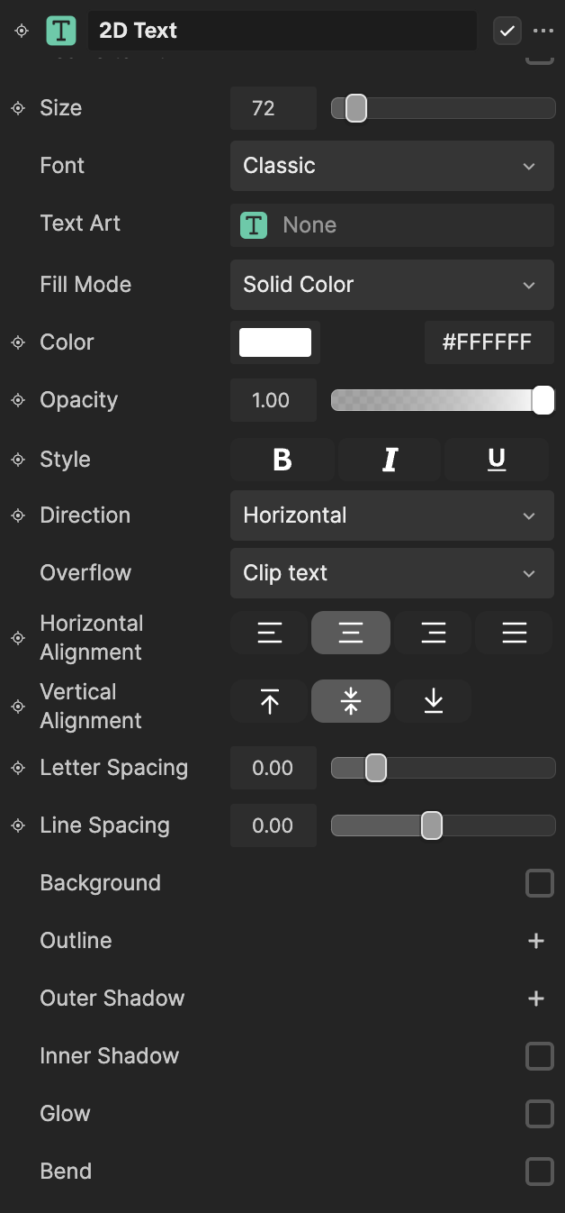
| Size | Sets the size of the text on the screen |
| Font | Determines the font style of the text |
| Text Art | Assigns a Text Art texture to the text |
| Color | Sets the HEX color of the text characters |
| Opacity | Adjusts text transparency, ranging from 0.0 (fully transparent) to 1.0 (fully opaque) |
| Style | - Bold: Makes the text thicker and darker
- Italic: Slants the text to the right
- Underline: Adds an underline beneath the text
|
| Direction | - Horizontal: Displays the text horizontally
- Vertical: Displays the text vertically
|
| Overflow | Controls how text is displayed when it exceeds the size of the text box. Choose from: - Clip Text: Truncates the text to fit within the defined text box, preventing overflow
- Show Ellipsis: Replaces overflowing text with an ellipsis (...) to indicate omitted content
- Clamp: Maintains the original font size and clamps the text content without shrinking or overflowing
- Shrink: Dynamically reduces the font size to fit the text within the box, down to the defined minimum font size
|
| Horizontal Alignment | - Horizontal Left: Displays the text horizontally and left-aligned
- Horizontal Center: Displays the text horizontally and center-aligned
- Horizontal Right: Displays the text horizontally and right-aligned
- Horizontal Justified: Aligns text evenly between the left and right margins, creating straight edges on both sides by adjusting spacing between words or characters for a unified, polished look
|
| Vertical Alignment | - Vertical Left: Displays the text vertically and left-aligned
- Vertical Center: Displays the text vertically and center-aligned
- Vertical Right: Displays the text vertically and right-aligned
|
| Letter Spacing | How far apart the characters are from each other. The range is from 0.0 to 1.0. |
| Line Spacing | How far apart the lines of text are from each other. The range is from 0.0 to 1.0. |
| Background | Sets a color block behind the text. If selected, you can adjust the following:
- Fill Mode: Determine if you want the background to be a Solid Color, Texture, or Gradient
- Background Color: The HEX color of the background
- Background Opacity: The transparency of the background. The range is from 0.0 to 1.0, with a default value of 1.0.
- Corner Radius: Adjusts the curvature of the background block's corners, allowing you to create rounded edges for a softer, smoother appearance
- Height: The height of the background block
- Width: The width of the background block
|
| Outline | Sets an outline around the text. If you click the Add button [+], you can add multiple outlines and adjust the following:
- Outline Color: The HEX color of the outline
- Outline Opacity: The transparency of the outline. The range is from 0.0 to 1.0, with a default value of 1.0.
- Outline Size: The size of the outline. The range is from 0 to 100, with a default value of 30.
|
| Outer Shadow | Sets an outer shadow around the text. If you click the Add button [+], you can add multiple outer shadows and adjust the following:
- Shadow Color: The HEX color of the shadow
- Shadow Opacity: The transparency of the shadow. The range is from 0.0 to 1.0, with a default value of 1.0.
- Shadow Offset: The offset of the shadow. The range is from 0 to 100, with a default value of 10.
- Shadow Angle: The angle of the shadow. The range is from -180 to 180, with a default value of -45.
- Shadow Feather: The intensity of feathering (soft edges) of the shadow. The range is from 0.0 to 1.0, with a default value of 0.00.
|
| Inner Shadow | Sets a shadow inside the text. If selected, you can adjust the following:
- Shadow Color: The HEX color of the shadow
- Shadow Opacity: The transparency of the shadow. The range is from 0.0 to 1.0, with a default value of 1.0.
- Shadow Offset: The offset of the shadow. The range is from 0 to 100, with a default value of 10.
- Shadow Angle: The angle of the shadow. The range is from -180 to 180, with a default value of -45.
- Shadow Feather: The intensity of feathering (soft edges) of the shadow. The range is from 0.0 to 1.0, with a default value of 0.00.
|
| Glow | Sets a glow to the text. If selected, you can adjust the following:
- Color: The HEX color of the glow
- Style: The style of the glow. Can be Outward (emitted away from the text) or Contoured (emitted around the text).
- Intensity: How bright the appearance of the glow looks. The range is from 0 to 1, with a default value of 0.5.
- Range: How far the glow light reaches. The range is from 0 to 1, with a default value of 0.5.
- Horizontal Angle: The horizontal direction of the emitted light. The range is from -0.5 to 0.5, with a default value of 0.00.
- Vertical Angle: The vertical direction of the emitted light. The range is from -0.5 to 0.5, with a default value of 0.00.
|
| Bend | Curves the text. If selected, you can adjust the following:
- Bend Strength: Controls how much the text curves. The range is from -100 to 100, with a default value of 0.
|